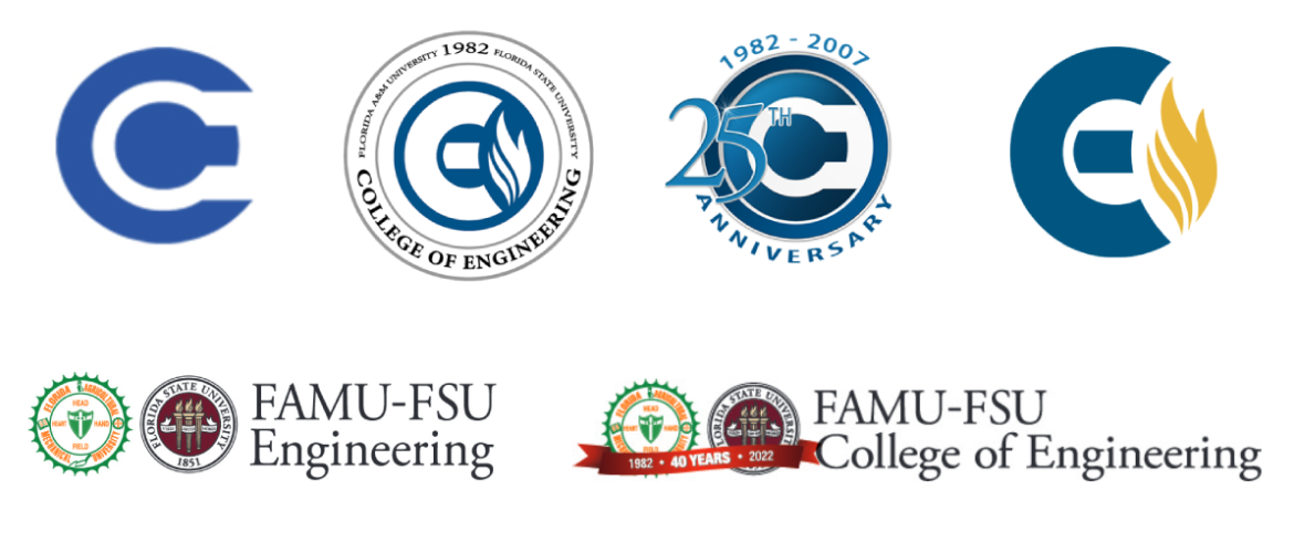
Left to right, top to bottom: The FAMU-FSU College of Engineering has had a progression of logos to represent the independent and joint nature of the unique model. (FAMU-FSU Engineering)
In 1971, graphic designer Carolyn Davidson came up with the iconic Nike Swoosh. The best logos are often simple, and the Nike logo is recognizable, all over the world.
However, what do you do when the logo you want to create represents a complicated, one-of-a-kind vision? Like the FAMU-FSU College of Engineering. That’s the dilemma JD Adams, a FAMU-FSU Engineering web designer, faced in 2007. How do you unify two universities, two mascots, and four different school colors into a unified vision?
Adams came up with a logo that evolved over a decade at the college.
“People complained that the original COE logo looked like a keyhole, “Adams said. “No real meaning behind it. So, I tried to figure out what both universities had in common, and right away the flame stood out.”
Adams noticed that the Florida State University already had three torches on its logo and Florida A&M University had the eternal flame, the heart of the college, in the center of campus. That became the common element that tied them together.
“I came up with the letters CE and the flame as our logo, “Adams said. “I used a three-pronged flame to represent the two universities and the third as the College of Engineering.”
Laurie Herring, who was working in the Department of Communication and Multimedia Services in 1998, recalled an earlier version of the seal.
“When I got here, we used the two university seals but they were offset, “Herring said. “It was always awkward to use the logo in some of the marketing materials we designed for the college. Our logo progressed to the keyhole design and eventually to JD’s design in 2007.”
The college’s original blue and yellow color scheme came directly from the interior architecture of the building, Herring said. From what she remembers, the administration used the royal blue of the metal stair railings in the original A Building, and the yellow from the iconic metal sculpture that hangs above the atrium there. For many decades, the blue-and-yellow CE logo defined the college’s brand.
Herring explained when Dean Murray Gibson arrived in 2016, the vision for the logo changed yet again.
“We had a new dean, a new vision and the logo was a big part of that,” Herring explained. “We wanted to emphasize the joint nature of our two colleges and our logo changed to our current one that has both university seals next to each other with the acronyms FAMU and FSU separated by a hyphen.”
The hyphen itself is significant because it represents our legal name and the partnership between the two universities.
Tisha Keller, the director of Marketing and Communication at the college, was instrumental in branding the college with marketing materials that followed Gibson’s vision for a new logo.
“Our logo is ever changing and continues to represent a partnership that is unique,” Keller said. “Our college is one-of-a-kind and as we grow, we will continue to assess our mission and use our logo to represent that mission.”
To celebrate the college’s 40th year, Keller added a red ribbon to the dual-seal logo. Forty years is the traditional “ruby anniversary,” and the ribbon ties the two university seals together, representing the nexus of history and tradition. The anniversary logo will be used officially throughout 2022.
“The joint college has always been hard to describe in a way that captures the unique model and partnership at the heart of this place,” Keller said. “A logo alone will never be able to tell the full story. That’s why we are intent on showing—through our marketing, programming, social media, culture and campus life—that the combination of two great institutions is more than the sum of the parts.”
